Prismatic
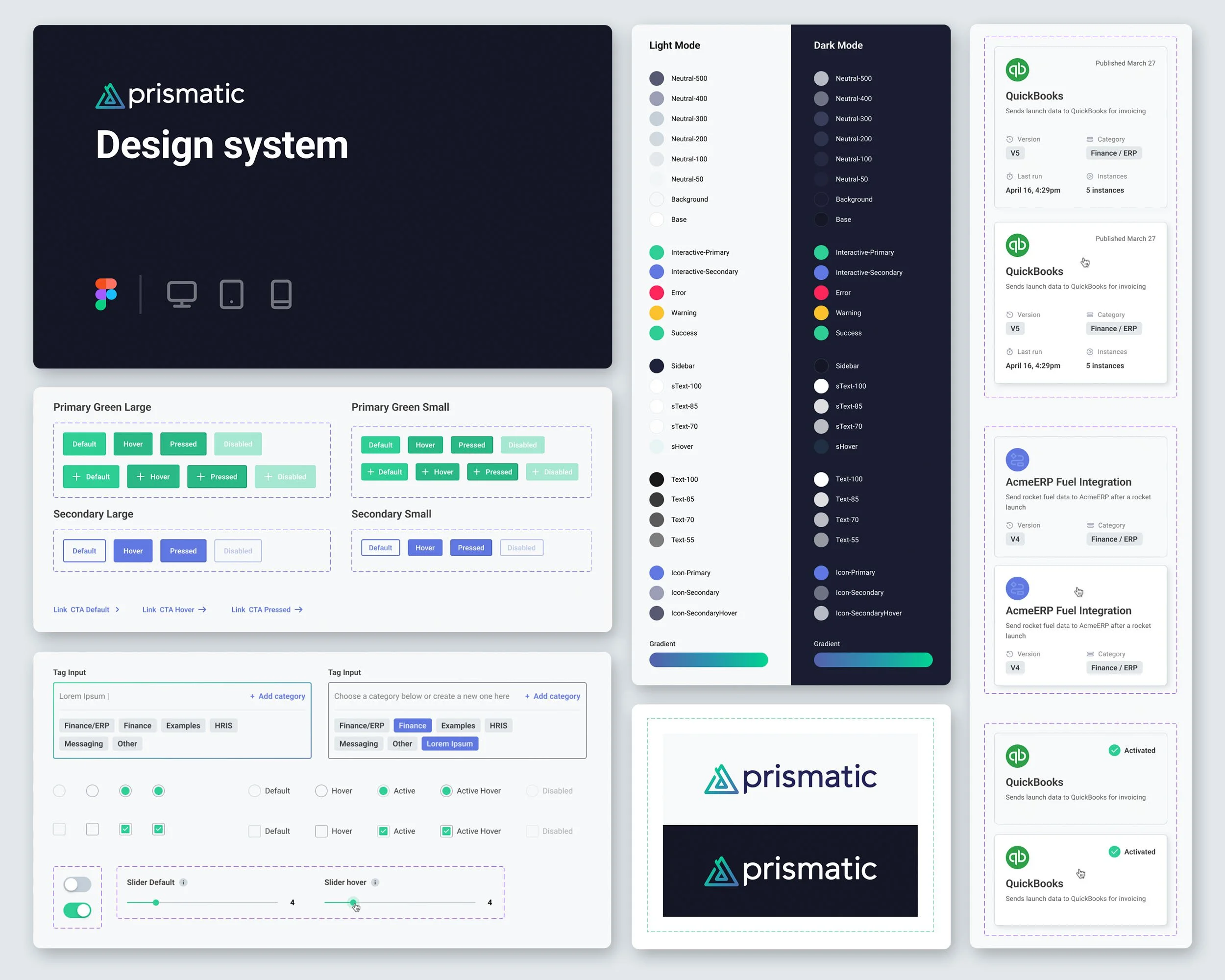
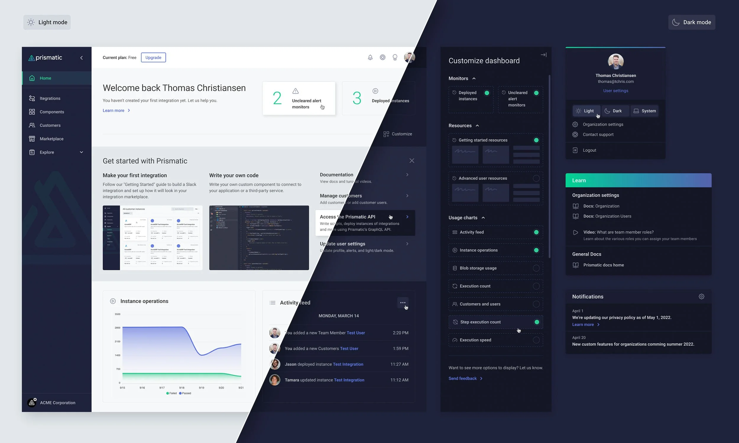
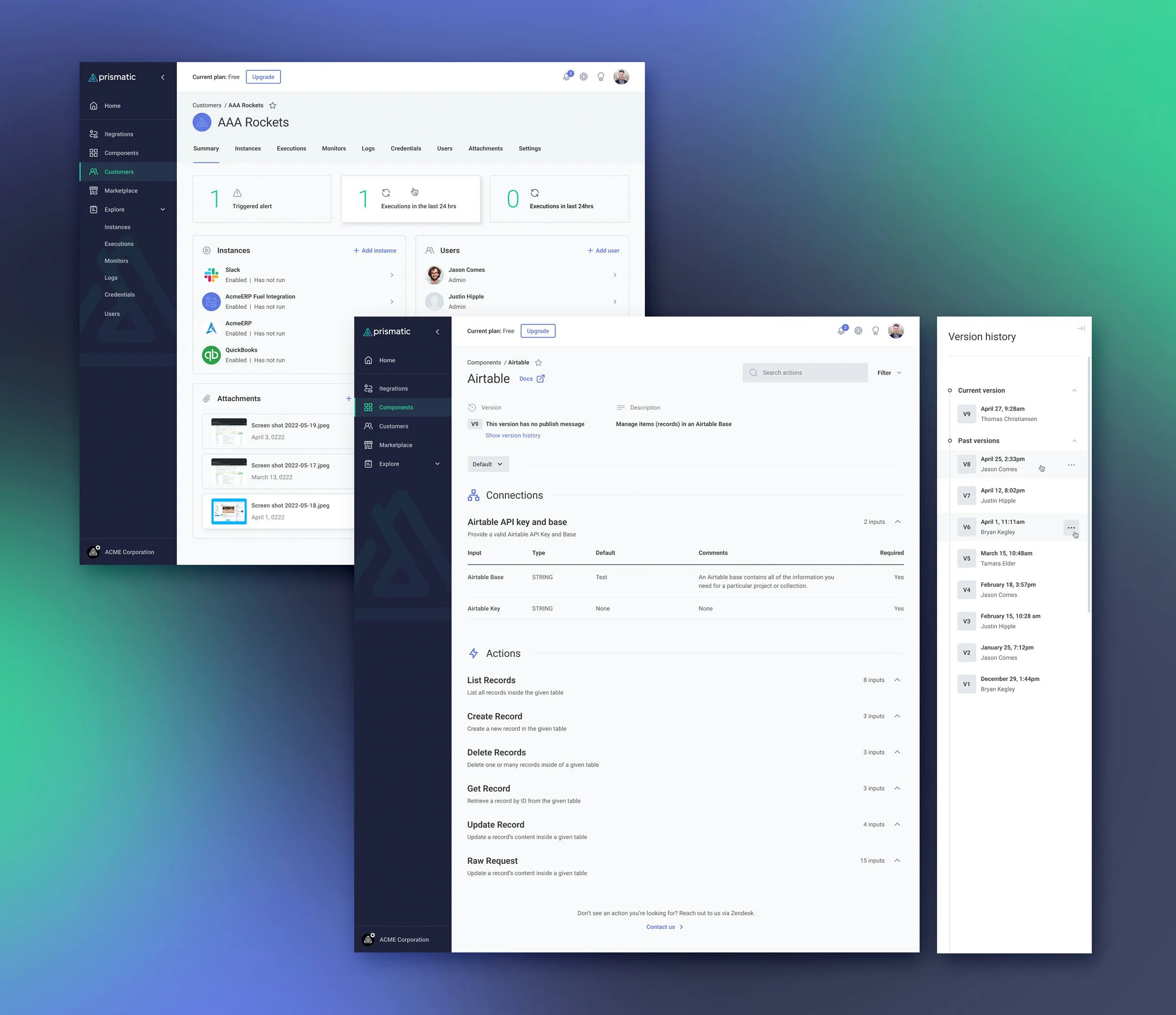
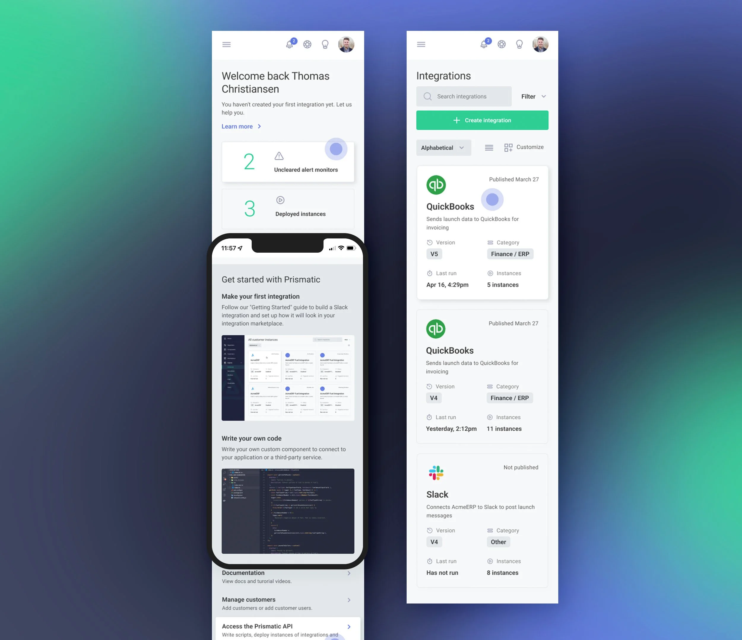
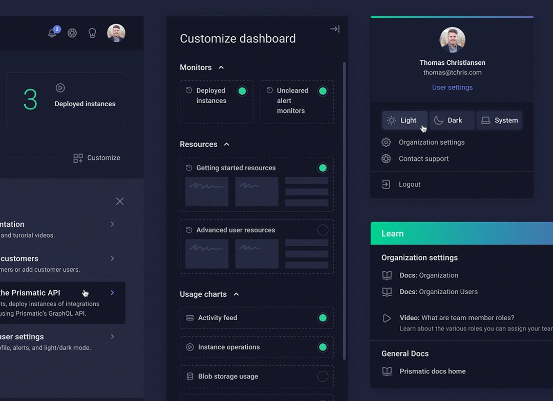
When Prismatic approached me to redesign their backend customer dashboard, I was eager to help. After creating a comprehensive design system in Figma, I had the building blocks to start laying out designs. My focus was to create a clean, intuitive, and user-friendly experience for their customers. I incorporated enhanced user functions, responsive design, and an improved dark mode.
The Prismatic team wanted to keep a good thing going and we began working on additional projects beyond the original ask. I am glad to continue working with their amazing team.


